TanStack Start: Part 3 - Design System
In the previous tutorial, we enhanced the developer experience for our TanStack Start app. In this tutorial, we'll set up a modern design system, consisting of a color scheme, font family, icon library, interactive UI components, and dark mode support, all powered by Shadcn UI[1].
Here are the steps we'll follow:
- Install NPM packages
- Set up custom styles
- Create color schemes
- Configure Tailwind theme
- Configure Shadcn CLI
- Add dark mode toggle
- Update the Home Page
Step 1 - Install NPM Packages
Run this command to install the packages we'll need for setting up the app's design system:
npm install shadcn \
  radix-ui \
  lucide-react \
  @fontsource-variable/inter \
  class-variance-authority \
  clsx \
  tailwind-merge \
  tw-animate-css \
  tanstack-router-theme-provider
Here's what each package does:
shadcn: CLI provided by Shadcn UI to download specific components to the project.radix-ui: Unstyled building blocks[2] for dialogs, dropdowns, etc. used by Shadcn UI.lucide-react: A large collection of SVG icons as React components used by Shadcn UI.@fontsource-variable/inter: A source to import and use the Inter[3] font in CSS files.class-variance-authority: Utility for defining component variants likesize&intent.clsx: A small utility for constructing complexclassNamestrings conditionally in JSX.tailwind-merge: Removes conflicting Tailwind classes while constructingclassName.tw-animate-css: Reusable animation utilities for overlays, dialogs, and other elements.tanstack-router-theme-provider: Theme provider and hook for dark mode support.
Step 2 - Set Up Custom Styles
In Part 2, we created a global src/styles.css file to set up Tailwind CSS and linked it from the root route. Add the following lines to import custom styles from the above packages:
@import "tailwindcss"; /* already present */
@import "tw-animate-css";
@import "shadcn/tailwind.css";
@import "@fontsource-variable/inter";
Here's what the new imports provide:
tw-animate-css: Tailwind animation utilities used in interactive Shadcn UI components.shadcn/tailwind.css: Custom Tailwind styles, utilities, and variants used by Shadcn UI.@fontsource-variable/inter: Makes theIntervariable font family available for use.
Most modern operating systems allow users to pick between Light and Dark color schemes. Tailwind automatically detects a user's color scheme using the prefers-color-scheme CSS media query, and provides a dark: variant to style your site differently for dark mode.
Add this line to src/styles.css to support manually switching between light and dark mode:
@custom-variant dark (&:is(.dark *));
This override[4] ensures that dark mode styles are applied only when the site's <html> tag has a class="dark" attribute, instead of depending on the prefers-color-scheme media query. We'll use the dark class to configure the color scheme and toggle modes manually.
Step 3 - Create Color Schemes
Shadcn UI components can be themed using a specific set of CSS variables[5] called theme tokens. Add these variables to styles.css to configure the color scheme[6] for light mode:
:root {
    --background: oklch(1 0 0);               /* Default background */
    --foreground: oklch(0.141 0.005 285.823); /* Default text/icon color */

    /* Context-specific background & text/icon colors */
    --card: oklch(1 0 0);
    --card-foreground: oklch(0.141 0.005 285.823);
    --popover: oklch(1 0 0);
    --popover-foreground: oklch(0.141 0.005 285.823);
    --primary: oklch(0.488 0.243 264.376);
    --primary-foreground: oklch(0.97 0.014 254.604);
    --secondary: oklch(0.967 0.001 286.375);
    --secondary-foreground: oklch(0.21 0.006 285.885);
    --muted: oklch(0.967 0.001 286.375);
    --muted-foreground: oklch(0.552 0.016 285.938);
    --accent: oklch(0.967 0.001 286.375);
    --accent-foreground: oklch(0.21 0.006 285.885);

    /* Other single-purpose colors */
    --destructive: oklch(0.577 0.245 27.325);
    --border: oklch(0.92 0.004 286.32);
    --input: oklch(0.92 0.004 286.32);
    --ring: oklch(0.705 0.015 286.067);

    /* Colors for chart elements */
    --chart-1: oklch(0.845 0.143 164.978);
    --chart-2: oklch(0.696 0.17 162.48);
    --chart-3: oklch(0.596 0.145 163.225);
    --chart-4: oklch(0.508 0.118 165.612);
    --chart-5: oklch(0.432 0.095 166.913);

    /* Sidebar-specific colors */
    --sidebar: oklch(0.985 0 0);
    --sidebar-foreground: oklch(0.141 0.005 285.823);
    --sidebar-primary: oklch(0.546 0.245 262.881);
    --sidebar-primary-foreground: oklch(0.97 0.014 254.604);
    --sidebar-accent: oklch(0.967 0.001 286.375);
    --sidebar-accent-foreground: oklch(0.21 0.006 285.885);
    --sidebar-border: oklch(0.92 0.004 286.32);
    --sidebar-ring: oklch(0.705 0.015 286.067);

    /* Base border radius size */
    --radius: 0.625rem;
}
Next, add these overrides to src/styles.css to configure the color scheme for dark mode:
.dark {
    --background: oklch(0.141 0.005 285.823);
    --foreground: oklch(0.985 0 0);

    --card: oklch(0.21 0.006 285.885);
    --card-foreground: oklch(0.985 0 0);
    --popover: oklch(0.21 0.006 285.885);
    --popover-foreground: oklch(0.985 0 0);
    --primary: oklch(0.424 0.199 265.638);
    --primary-foreground: oklch(0.97 0.014 254.604);
    --secondary: oklch(0.274 0.006 286.033);
    --secondary-foreground: oklch(0.985 0 0);
    --muted: oklch(0.274 0.006 286.033);
    --muted-foreground: oklch(0.705 0.015 286.067);
    --accent: oklch(0.274 0.006 286.033);
    --accent-foreground: oklch(0.985 0 0);

    --destructive: oklch(0.704 0.191 22.216);
    --border: oklch(1 0 0 / 10%);
    --input: oklch(1 0 0 / 15%);
    --ring: oklch(0.552 0.016 285.938);

    --chart-1: oklch(0.845 0.143 164.978);
    --chart-2: oklch(0.696 0.17 162.48);
    --chart-3: oklch(0.596 0.145 163.225);
    --chart-4: oklch(0.508 0.118 165.612);
    --chart-5: oklch(0.432 0.095 166.913);

    --sidebar: oklch(0.21 0.006 285.885);
    --sidebar-foreground: oklch(0.985 0 0);
    --sidebar-primary: oklch(0.623 0.214 259.815);
    --sidebar-primary-foreground: oklch(0.97 0.014 254.604);
    --sidebar-accent: oklch(0.274 0.006 286.033);
    --sidebar-accent-foreground: oklch(0.985 0 0);
    --sidebar-border: oklch(1 0 0 / 10%);
    --sidebar-ring: oklch(0.552 0.016 285.938);
}
By default, theme tokens have the values configured in the :root block i.e. for the light color scheme, but when dark mode is turned on by adding the dark class to the page's <html> tag, these variables are overridden by the values configured in the .dark block.
Step 4 - Configure Tailwind Theme
To make the colors (e.g. --primary) configured above accessible via dynamically generated Tailwind utility classes (e.g. bg-primary, text-primary, border-primary etc.), we'll define some special CSS variables using the @theme directive[7]. Add this code to src/styles.css:
@theme inline {
    /* Body and heading fonts */
    --font-sans: 'Inter Variable', sans-serif;
    --font-heading: var(--font-sans);

    /* Theme-based colors */
    --color-foreground: var(--foreground);
    --color-background: var(--background);

    --color-accent-foreground: var(--accent-foreground);
    --color-accent: var(--accent);
    --color-muted-foreground: var(--muted-foreground);
    --color-muted: var(--muted);
    --color-secondary-foreground: var(--secondary-foreground);
    --color-secondary: var(--secondary);
    --color-primary-foreground: var(--primary-foreground);
    --color-primary: var(--primary);
    --color-popover-foreground: var(--popover-foreground);
    --color-popover: var(--popover);
    --color-card-foreground: var(--card-foreground);
    --color-card: var(--card);

    --color-ring: var(--ring);
    --color-input: var(--input);
    --color-border: var(--border);
    --color-destructive: var(--destructive);

    --color-chart-5: var(--chart-5);
    --color-chart-4: var(--chart-4);
    --color-chart-3: var(--chart-3);
    --color-chart-2: var(--chart-2);
    --color-chart-1: var(--chart-1);

    --color-sidebar-ring: var(--sidebar-ring);
    --color-sidebar-border: var(--sidebar-border);
    --color-sidebar-accent-foreground: var(--sidebar-accent-foreground);
    --color-sidebar-accent: var(--sidebar-accent);
    --color-sidebar-primary-foreground: var(--sidebar-primary-foreground);
    --color-sidebar-primary: var(--sidebar-primary);
    --color-sidebar-foreground: var(--sidebar-foreground);
    --color-sidebar: var(--sidebar);

    /* Theme-based radius sizes */
    --radius-sm: calc(var(--radius) * 0.6);
    --radius-md: calc(var(--radius) * 0.8);
    --radius-lg: var(--radius);
    --radius-xl: calc(var(--radius) * 1.4);
    --radius-2xl: calc(var(--radius) * 1.8);
    --radius-3xl: calc(var(--radius) * 2.2);
    --radius-4xl: calc(var(--radius) * 2.6);
}
Variables prefixed with --color-* are used to generate those utility classes where colors are applicable (e.g. bg-*, text-*, border-*). Similarly, variables prefixed with --font-* and --radius-* are used to generate text and border related utility classes respectively.
Finally, add this to src/styles.css to apply some base[8] text and color styles to the app:
@layer base {
  * {
    @apply border-border outline-ring/50;
    }
  body {
    @apply bg-background text-foreground;
    }
  html {
    @apply font-sans;
    }
}
Step 5 - Configure Shadcn CLI
The shadcn package does not export React components. Instead, it provides a command line interface (CLI) that generates the source code for specific components on demand. Create a file components.json in the project root with these contents to configure the CLI:
{
  "$schema": "https://ui.shadcn.com/schema.json",
  "style": "radix-nova",
  "rsc": false,
  "tsx": true,
  "tailwind": {
    "config": "",
    "css": "src/styles.css",
    "baseColor": "zinc",
    "cssVariables": true,
    "prefix": ""
  },
  "iconLibrary": "lucide",
  "rtl": false,
  "aliases": {
    "components": "@/components",
    "utils": "@/lib/utils",
    "ui": "@/components/ui",
    "lib": "@/lib",
    "hooks": "@/hooks"
  },
  "menuColor": "default",
  "menuAccent": "subtle",
  "registries": {}
}
The configuration options are described in detail on the docs site. Here's a quick overview:
styleis a hyphenated string (e.g.radix-nova). The first part controls the underlying component library (radixfor Radix UI orbasefor Base UI). The second part controls spacing, border radii, base font size etc. You can choose among several built-in styles.tailwind: Describes where Tailwind is configured and how generated theme tokens work. Thecsskey configures the path of the main CSS file,baseColoris used to tint backgrounds & text, andcssVariablescontrols if CSS variables are used for theming.iconLibrary: Selects which icon library generated components should use by default. The following libraries are supported: Lucide, Tabler, HugeIcons, Phosphor, and Remix.aliases: Configures the paths for various files & folders used during code generation. The generated components are placed in theuifolder (@/components/uiin this case).
Next, create a file src/lib/utils.ts and add the cn helper function[9] used by Shadcn UI:
import { clsx, type ClassValue } from "clsx"
import { twMerge } from "tailwind-merge"

// Combine class strings & resolve Tailwind conflicts
export function cn(...inputs: ClassValue[]) {
  return twMerge(clsx(inputs))
}
Finally, you can run this command to generate the Button and Dropdown Menu components:
npx shadcn@latest add button dropdown-menu
Two new files, button.tsx & dropdown-menu.tsx, are generated inside src/components/ui.
Step 6 - Add Dark Mode Toggle
We'll use the button and dropdown menu components generated above to create a custom ModeToggle component for manually switching between the Light, Dark and System color schemes. Create a file mode-toggle.tsx in src/components with the following code[10]:
import { Moon, Sun } from "lucide-react"
import { useTheme } from "tanstack-router-theme-provider"
import { Button } from "@/components/ui/button"
import {
  DropdownMenu,
  DropdownMenuContent,
  DropdownMenuItem,
  DropdownMenuTrigger,
} from "@/components/ui/dropdown-menu"

export function ModeToggle() {
  const { setTheme } = useTheme()

  return (
    <DropdownMenu>
      <DropdownMenuTrigger asChild>
        <Button variant="outline" size="icon">
          <Sun className="h-[1.2rem] w-[1.2rem] scale-100 rotate-0 transition-all dark:scale-0 dark:-rotate-90" />
          <Moon className="absolute h-[1.2rem] w-[1.2rem] scale-0 rotate-90 transition-all dark:scale-100 dark:rotate-0" />
          <span className="sr-only">Toggle theme</span>
        </Button>
      </DropdownMenuTrigger>
      <DropdownMenuContent>
        <DropdownMenuItem onClick={() => setTheme("light")}>Light</DropdownMenuItem>
        <DropdownMenuItem onClick={() => setTheme("dark")}>Dark</DropdownMenuItem>
        <DropdownMenuItem onClick={() => setTheme("system")}>System</DropdownMenuItem>
      </DropdownMenuContent>
    </DropdownMenu>
  )
}
We're using the useTheme hook from tanstack-router-theme-provider, which requires a ThemeProvider[11] to detect and set the color scheme. Add it to src/routes/__root.tsx:
// add this below existing imports..
import { ThemeProvider } from 'tanstack-router-theme-provider'

export const Route = // existing code..

function RootComponent() {
  return (
    <html lang="en" suppressHydrationWarning>
      <head><HeadContent /></head>
      <body>
        <ThemeProvider>
          <Outlet />
          <Scripts />
          <TanStackDevtools plugins={[{ name: "Tanstack Router", render: <TanStackRouterDevtoolsPanel /> }]} />
        </ThemeProvider>
      </body>
    </html>
  )
}
The <ThemeProvider> wraps everything inside the <body> and a suppressHydrationWarning prop is added to <html> to prevent HTML mismatch warning due to server-side rendering[12].
Step 7 - Update the Home Page
Update the index route src/routes/index.tsx to use ModeToggle and Button components:
import { createFileRoute, Link } from "@tanstack/react-router"
import { useState } from "react"
import { ModeToggle } from "@/components/mode-toggle"
import { Button } from "@/components/ui/button"

export const Route = createFileRoute("/")({ component: IndexPage })

function IndexPage() {
  const [count, setCount] = useState(0)
  return (
    <div className="p-4">
      <div className="flex items-center gap-4 mb-4">
        <span className="font-medium">Home</span>
        <Link to="/about" className="text-blue-500 hover:text-blue-500">
          About
        </Link>
        <ModeToggle />
      </div>
      <Button type="button" onClick={() => setCount(count + 1)} className="w-30 cursor-pointer">
        Click Me: {count}
      </Button>
    </div>
  )
}
Run npm run dev and open the URL http://localhost:3000 to view the updated home page:
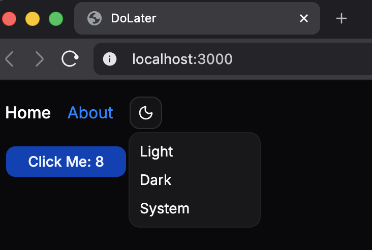
The design system is fully in effect and you can easily switch between light and dark modes. Finally, run these commands to add the changes to Git, create a commit, and push to GitHub:
git add .
git commit -m "Add design system and dark mode"
git push
Conclusion
In this tutorial, we set up the design system for our app using Shadcn UI. We imported the required packages, defined light and dark theme tokens, connected the theme to Tailwind, generated UI components, and updated the home page with a working dark mode toggle.
You can use the Shadcn CLI to update any aspect of the design system (style, font, colors, icons, etc.) programmatically. Visit the New Project page to customize & preview new styles, copy the preset ID, and run npx shadcn apply --preset <pid> to apply the selected preset.
Here's the finished code: https://github.com/swiftace-org/tanstack-start-tutorial/tree/part-3
In the next tutorial, we'll add user authentication with Log in & Sign up screens to the project.
Footnotes
Shadcn UI is not a traditional UI component library. Instead of importing and using prebuilt components from an NPM package, you use a CLI to generate source files within your project based on a fully configurable & customizable design system.
Radix UI solves the hard parts of building interactive components: keyboard interaction, focus management, ARIA attributes, layering, and other accessibility logic. It's headless i.e. it intentionally leaves out styling and visual design so it can fit any design system.
Inter is a popular sans-serif typeface designed for user interfaces. The
@fontsource-variable/interpackage provides it as a variable font, so you can use different font weights in CSS without importing separate files for each weight (medium, bold, etc.).@custom-variantis a Tailwind directive for defining your own variants. Here it redefinesdark:to match any element inside a parent with thedarkclass. In our app, thedarkclass will be applied to the site's<html>tag usingtanstack-router-theme-provider.CSS variables (also called custom properties) are named CSS values like
--backgroundor--primarythat can be reused withvar(...). They are scoped using CSS selectors, so they can be initialized on the:rootand overridden in specific contexts like.dark.CSS colors can be written in formats like hex,
rgb(),hsl(), andoklch(). Inoklch(lightness chroma hue / alpha), lightness controls brightness, chroma controls color intensity, and hue selects the base color, making it easier to adjust consistently.In Tailwind CSS, variables defined with
@themeare special design tokens that generate utility classes and variants. Here's the full list of predefined design tokens you can use and customize: https://tailwindcss.com/docs/theme#default-theme-variable-referenceTailwind's
@layer baseis used for low-level global styles on plain HTML elements likebody,h1,a, or*. Tailwind merges these rules into itsbaselayer, so they load in the correct order alongside its built-in reset and remain easy to override with utility classes.clsxturns mixed inputs likeprops.className,'px-2 text-center'andisActive && 'bg-primary'into one class string.twMergeremoves conflicting Tailwind utilities, so'px-2 px-4'becomes'px-4'. Thecn()function combines their functionalities.Shadcn uses a compound component API:
<DropdownMenu>holds shared state while child components likeTrigger,Content&MenuItemdeclare different parts of the UI. TheasChildprop on the trigger reuses the child<Button>, avoiding a wrapper button.React's context system lets data be shared with deeply nested components without passing props through every level. A provider like
<ThemeProvider>places a context value above the tree, and hooks likeuseTheme()read or update it anywhere below.tanstack-router-theme-providerstores the selected theme in the browser's local storage. During server-side renderinglocalStorageis unavailable, so it's not known whether thedarkclass should be applied to<html>, leading to a hydration mismatch.